The Noisiest Block in the Neighborhood: Analyzing NYC Data with Mongolite
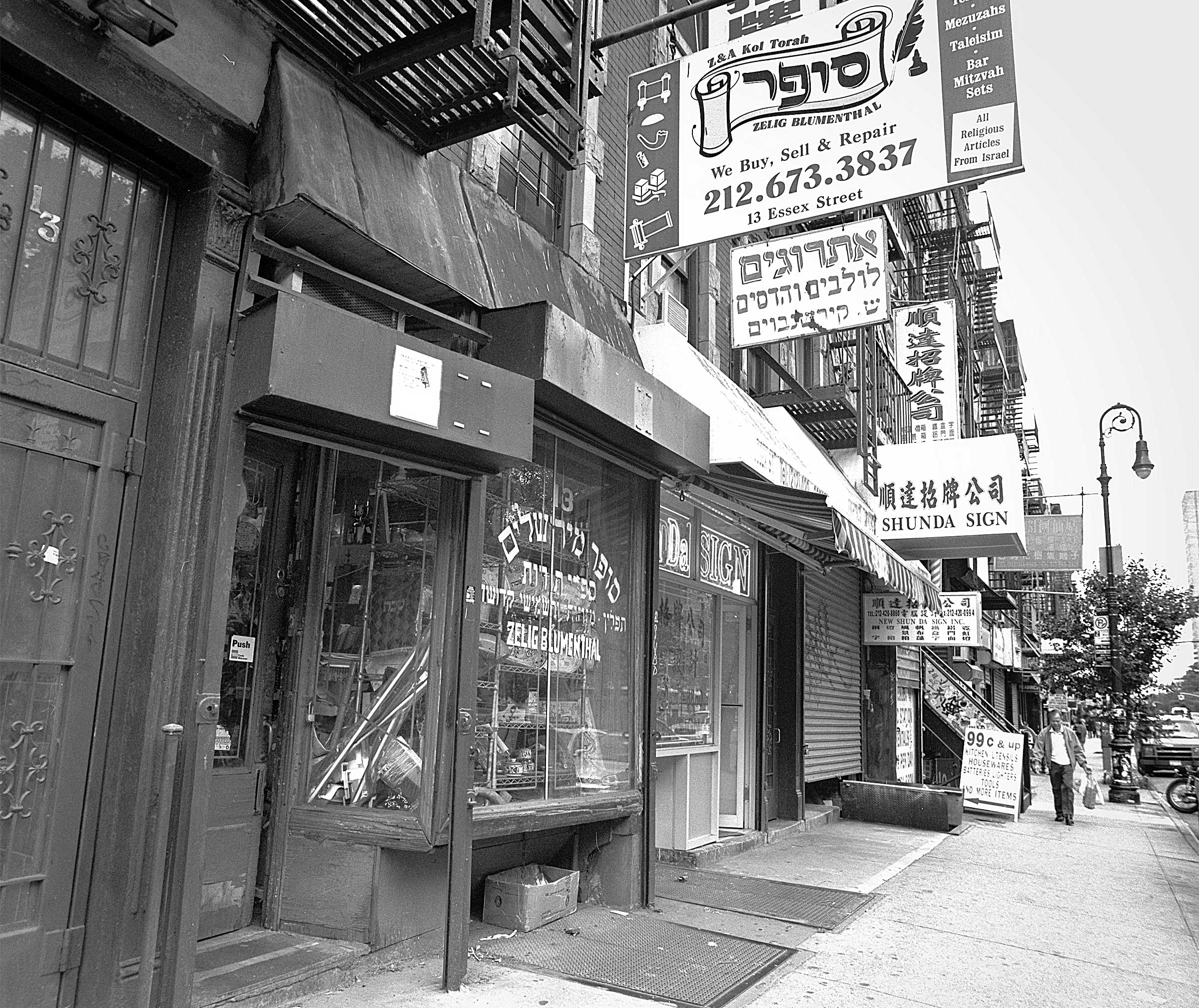
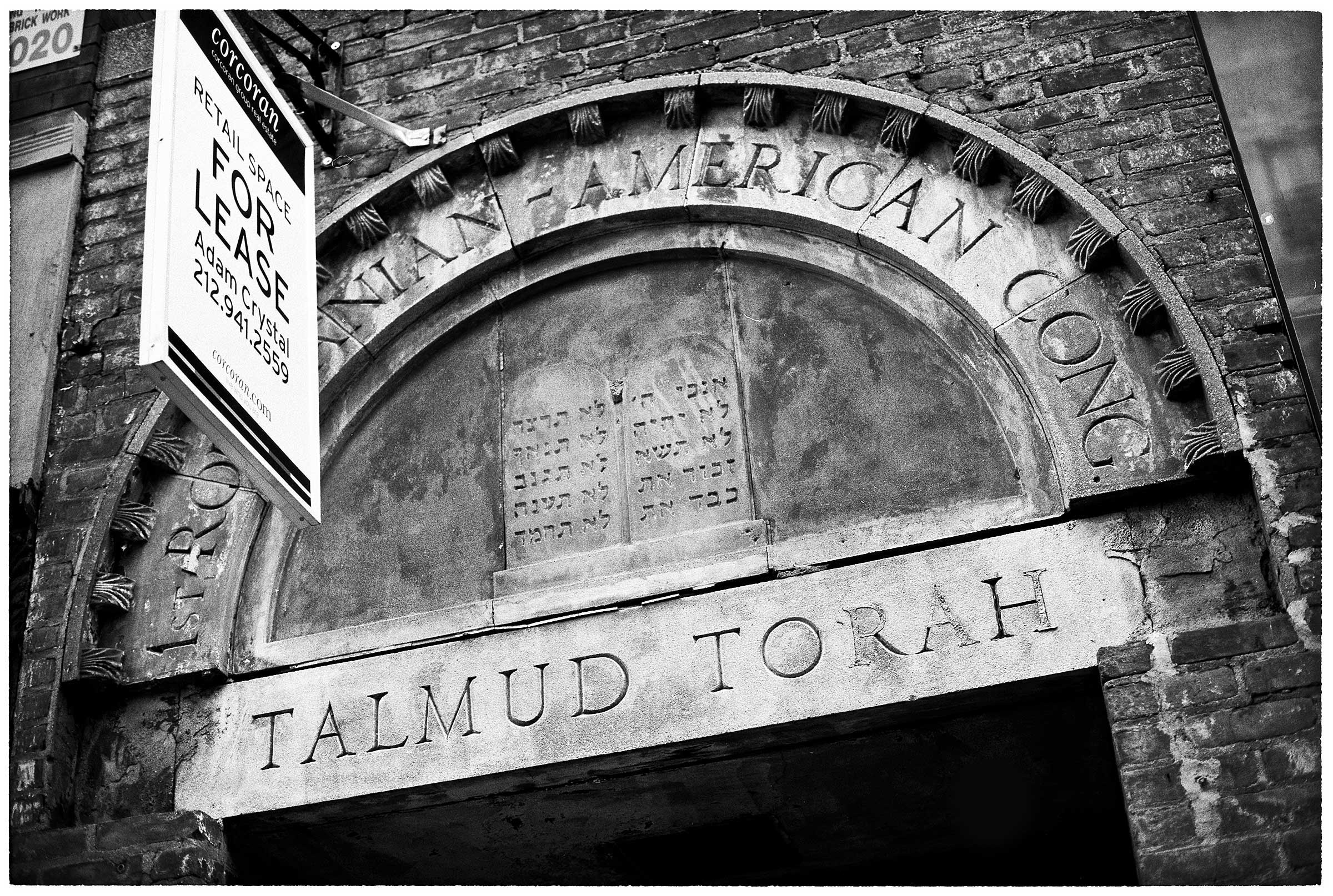
Back in 2012, I ended my seven years of residence on the Lower East Side and moved into an apartment with my girlfriend in Stuyvesant Town a mile north. I’d loved the LES when I first came to New York, because it was where my Jewish ancestors had first lived when they came to America a century ago, and their history still showed on every corner. I lived on Orchard Street, across from a Jewish corset shop, around the corner from the salmon specialists at Russ & Daughters. Half a block in the other direction was the Roumanian-American Synagogue, huge and old, once so famous for its Hebrew singing it was called the “Cantor’s Carnegie Hall.”
But by the time I left the Lower East Side, the synagogue had fallen down, the neighborhood was losing its history, and it was turning into something else: a noisy bar scene.
This weekend I was thinking about my old block, and decided to analyze how much worse the noise had gotten there over the last few years, and whether it was my block or another one that had become the cacophony’s epicenter. It would be an excuse to play with three tools I’ve meant to try: MongoDB Compass, the MongoDB R driver Mongolite, and New York City’s open data.
New York City publishes, among many enthralling data sets, a list of all calls to its 3-1-1 complaint line since 2010. I downloaded the ten-gigabyte CSV file, converted it to JSON with a Python script, and loaded it into MongoDB with mongoimport.
cat 311_Service_Requests_from_2010_to_Present.csv |
  three-eleven-to-json.py |
  mongoimport --collection three_eleven
A couple minutes later, the data-loading finished and I opened MongoDB Compass for an overview.
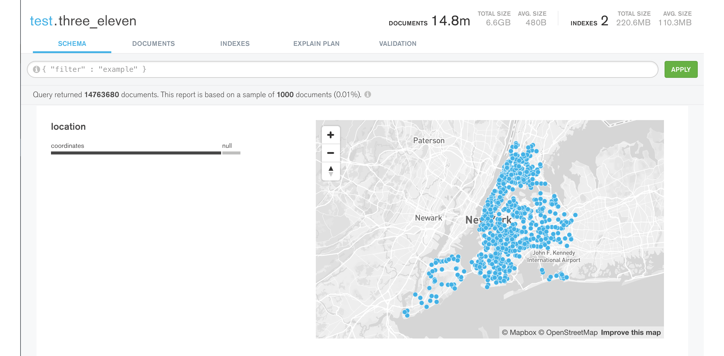
Compass noticed that each complaint includes a latitude and longitude, and plotted them on a map. I wanted to use this location data efficiently in my analysis so I told Compass to create a geospatial index:

My two questions were these: How much worse had the noise grown over the last few years? And, was my old block the worst in the neighborhood? For answers I turned to the R programming language, and the fine R driver for MongoDB which just released version 1.0 this month: Mongolite.
In my final year living on Orchard Street, my block had turned into a small war between police and drunken twentysomethings. Every Friday through Sunday, cops on horseback patrolled the street and a mobile police tower lifted itself high above the pavement to illuminate the neighborhood, while NYU students staggered from bar to bar and dance beats from the club downstairs vibrated my old tenement building. It seemed so bad by the time I left in 2012, could it have gotten any worse?
For my first analysis, I wanted to know if calls to 3-1-1 from the area had risen overall. I needed to query MongoDB for calls from the neighborhood, bring them into the R environment with mongolite, and convert them to an R dataframe. To begin, I imported some libraries and connected to my local MongoDB:
library(dplyr)
library(lubridate)
library(mongolite)

mdb <- mongo("three_eleven", url = "mongodb://localhost/test")
Then I used a $centerSphere query with my geospatial index to find all complaints originating near Orchard Street:
get_complaints <- function(query) {
    res <- mdb$find(query)
    # Extract lon/lat from GeoJSON
    # like {type: "Point", coordinates: [1, 2]}
    coords <- res$location['coordinates'][[1]]
    lons <- sapply(coords, function (x) x[1])
    lats <- sapply(coords, function (x) x[2])

    # Convert from UTC to US Eastern, very crudely.
    created <-
    as.POSIXct(res$created, origin = "1970-01-01 05:00:00")
    data.frame(
        lons = lons,
        lats = lats,
        type = res$complaintType,
        created = created,
        month = floor_date(created, "month"),
        is_noise = grepl(
            "noise",
            res$complaintType,
            ignore.case = TRUE
        )
    )
}

# 2nd centerSphere param is radians.
# To convert from meters, div by 6378100.
# Get all complaints within 500 meters of
# my apartment before midnight March 1 UTC.
complaints <- get_complaints('{
    "location": {
        "$geoWithin": {
            "$centerSphere": [
                [-73.98891066960417,40.72078970710123],
                0.00007839325190887568
            ]
        }
    },
    "created": {
        "$lt": {"$date": "2017-03-01T00:00:00.000Z"}
    }
}')

by_month = summarise(
    group_by(complaints, month),
    count = n(),
    pct_noise = 100 * sum(is_noise) / n()
)
This was simple enough, and it allowed me to plot the rise in calls to 3-1-1 from within 500 meters of my old apartment:
plot(select(by_month, month, count))
abline(lm(by_month$count ~ by_month$month))
Indeed, there were more calls of all kinds over time:
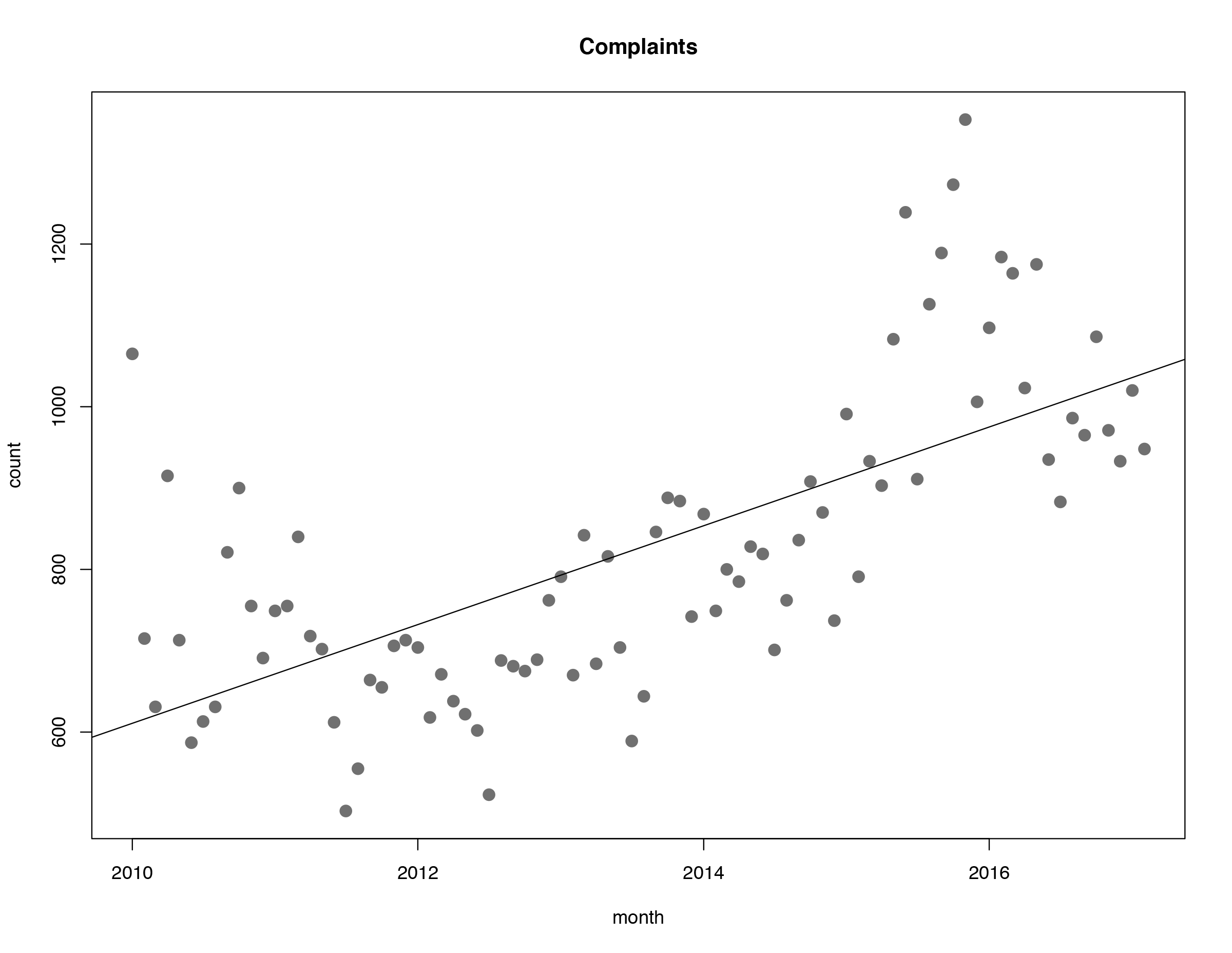
But that didn’t prove the noise had gotten worse. Perhaps population growth alone accounted for the greater call volume, or maybe residents were calling about other nuisances besides the drunken weekend circus. Had noise complaints come to dominate calls to 3-1-1?
plot(select(by_month, month, pct_noise))
abline(lm(by_month$pct_noise ~ by_month$month))
Yes, noise complaints were mounting, from barely 20% of calls to over 40%:
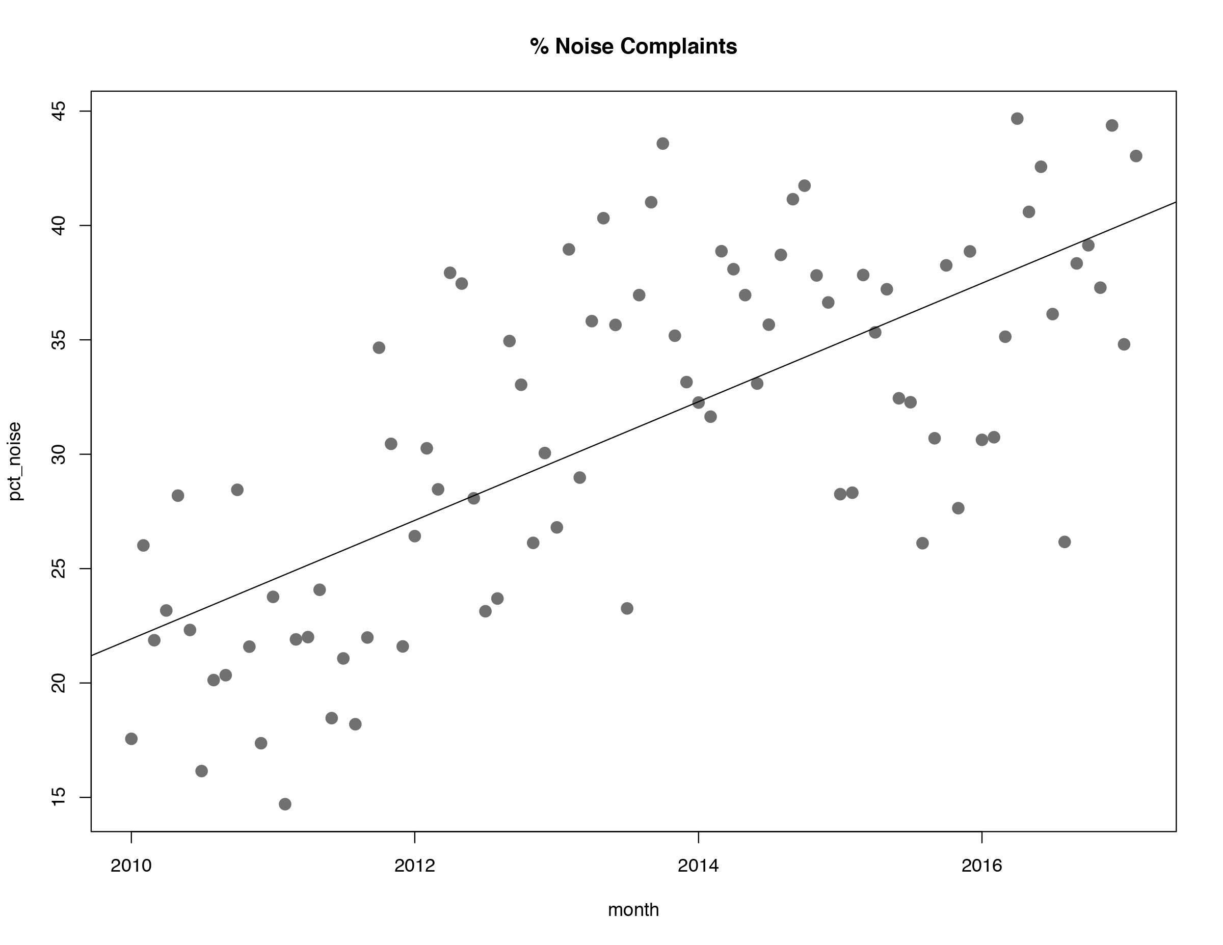
My first question was answered without a doubt, but I was still curious about the second: was Orchard Street the epicenter of noise?
I queried MongoDB again. Rather than getting all calls within 500 meters and seeing how many had been noise complaints, instead I queried only for noise complaints, using a regular expression filter, and expanded the radius to a kilometer.
# Get only noise complaints, for a 1km around.
noise_complaints <- get_complaints('{
    "complaintType": {"$regex": "noise", "$options": "i"},
    "location": {
        "$geoWithin": {
            "$centerSphere": [
                [-73.98891066960417,40.72078970710123],
                0.00015678650381775137
            ]
        }
    },
    "created": {
        "$lt": {"$date": "2017-03-01T00:00:00.000Z"}
    }
}')
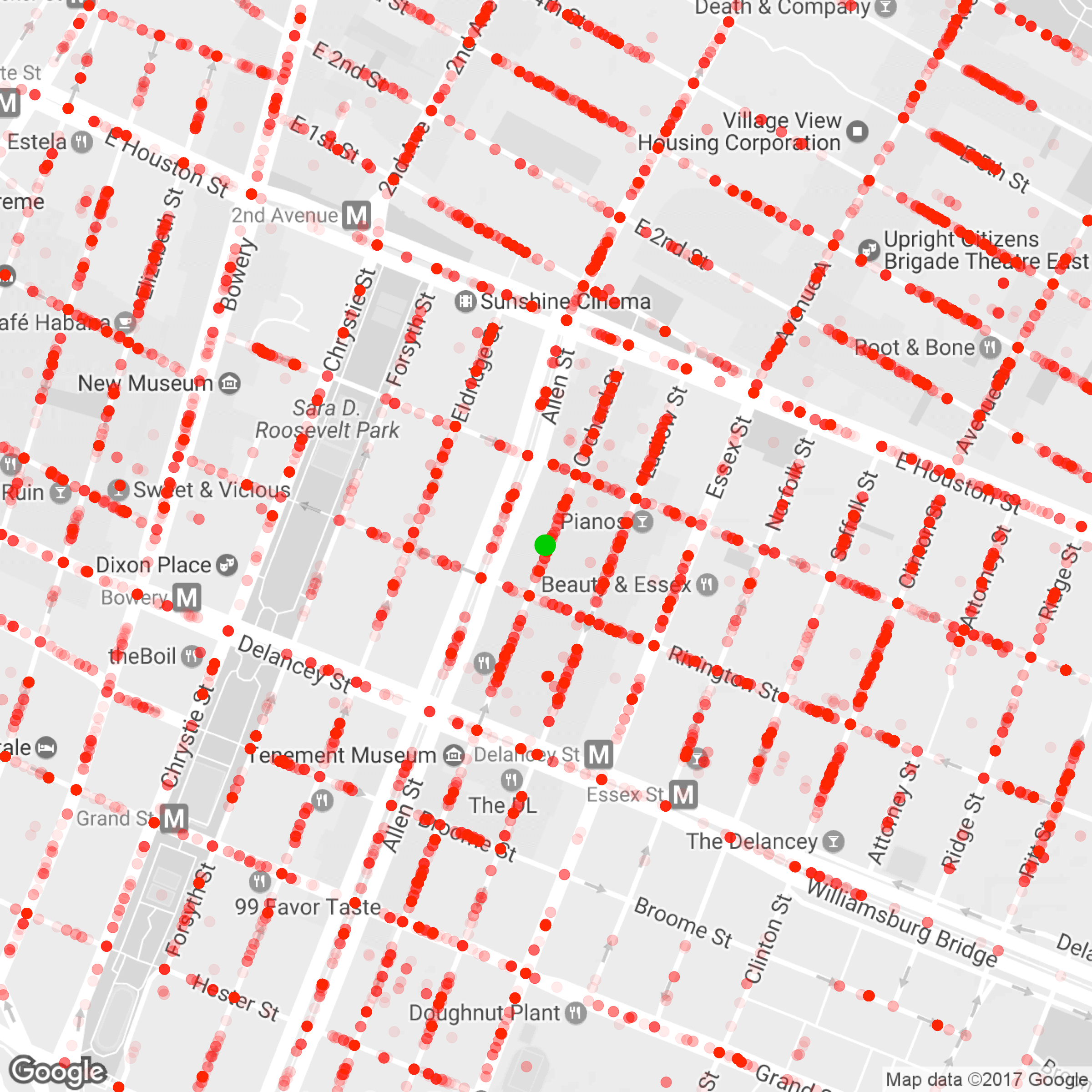
I tried to find the noisiest block visually by plotting a red dot for each complaint.
library(ggmap)

orchard_st = data.frame(
    lon = -73.98891066960417,
    lat = 40.72078970710123
)

orchard_st_map <- ggmap(
    get_map(
        location = orchard_st,
        color = "bw", zoom = 16
    ),
    extent = "device"
)

orchard_st_marker = geom_point(
    aes(x=lon, y=lat), color="#00cc00",
    size=4, data = orchard_st
)

orchard_st_map +
geom_point(
    aes(x = lons, y = lats),
    colour = "red",
    alpha = 0.1,
    size = 2,
    data = noise_complaints
) + orchard_st_marker
The dots painted each street so thickly, though, that no single location could be convicted beyond doubt of being loudest.
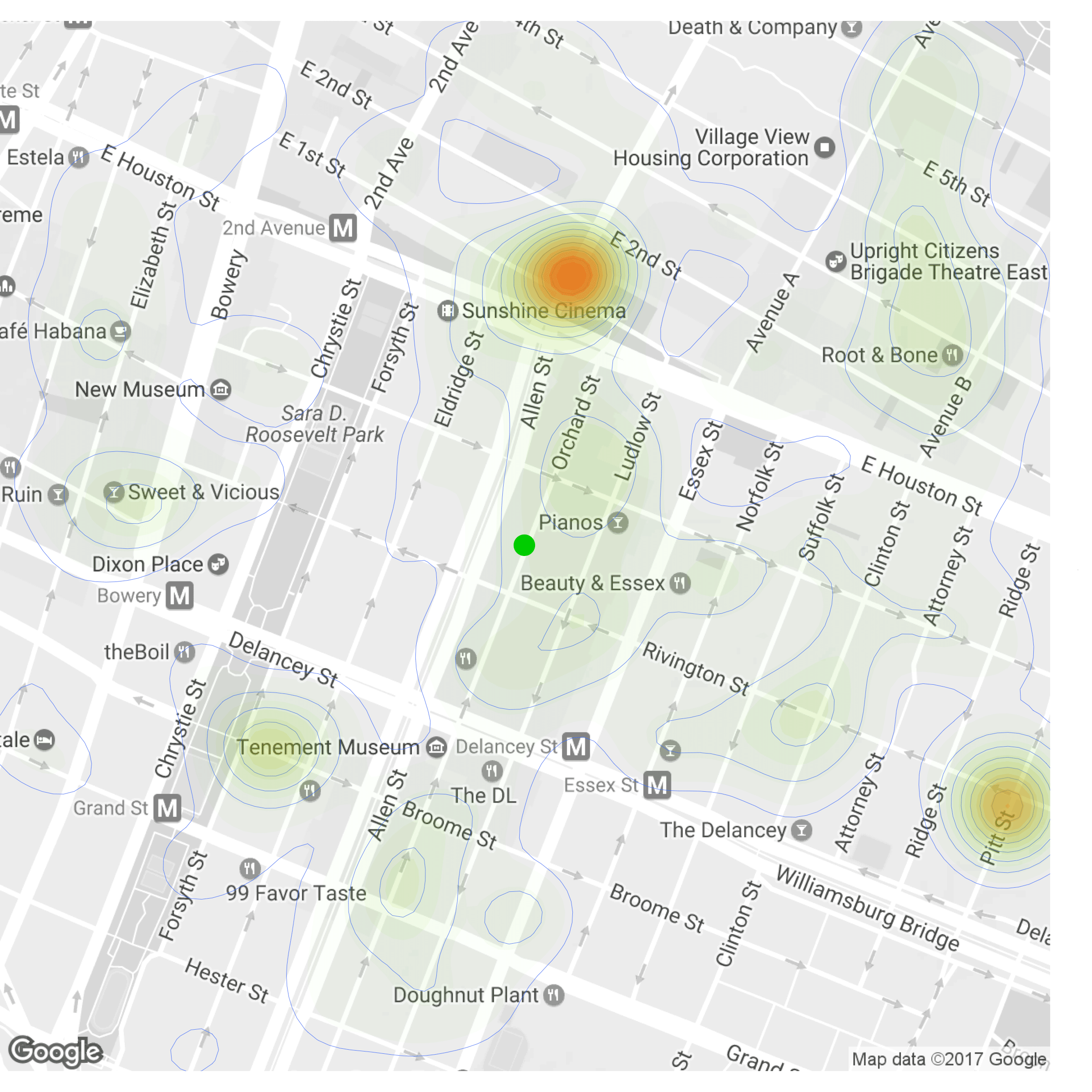
Instead, to prove which block was worst, I drew noisiness contours over the neighborhood with the density estimation function included in ggplot:
# "stat_density2d" from ggplot estimates contours from discrete samples.
orchard_st_map +
geom_density2d(
    data = noise_complaints,
    aes(x = lons, y = lats),
    size = 0.3
) + stat_density2d(
    data = noise_complaints,
    aes(x = lons, y = lats, fill = ..level.., alpha = ..level..),
    size = 0.01,
    bins = 16,
    geom = "polygon"
) + scale_fill_gradient(low = "green", high = "red") +
scale_alpha(range = c(0, 0.3), guide = FALSE)
I wasn’t too surprised to see that the actual hellmouth was a couple blocks north of Orchard Street, at First Avenue and First Street:
Still, my apartment of seven years is hardly in a quiet old neighborhood anymore. I miss what the Lower East Side was, but the numbers are unmistakable: it has only gotten worse since I left.
Links: