Against the new Google Reader UI
The update to Google Reader highlights a profound error in Google's interface updates: Each update decreases information density.
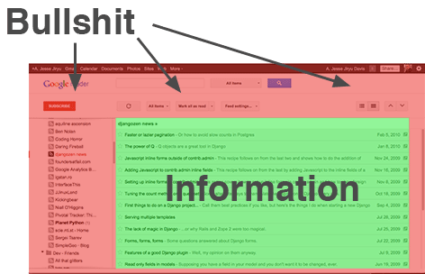
With Google Reader's new interface, I can see a list of only 12 new articles. I subscribe to 115 blogs, so I need a little more information to fit on one screen, thank you very much. The main problem is the ocean of white space in which all the controls now float. On my Macbook Pro, the actual information I want — the list of new articles — is allotted only 54% of the browser window:

Google seems to be aware that we might want some of our info back on our screens; they've published a FAQ about increasing info density in GMail, but alas the density control they describe doesn't exist in most of their products, like Reader.
Dear Google: a cluttered interface is one with lots of kinds of information, not one with lots of info. The point of an uncluttered interface is to let me see lots of useful data. By adding more whitespace, and decreasing information density, you are accomplishing the opposite of what an uncluttered interface should do.
But maybe I shouldn't throw stones, since this blog itself uses a lot of whitespace. I argue that I don't need to present much data to you, compared to what Google Reader must present, so I can afford the SoHo-gallery look. What do you think?
UPDATE: Google Reader's ex-product manager has some very harsh things to say about the new Reader.